Flawed but improving? How the global public understand inflation
A year of high inflation has improved consumer understanding of inflation in the UK.
This is an important political subplot given cost of living pressures: expectations of inflation are an important ingredient in the much-measured but imperfectly-understood idea of “consumer confidence”. Expectations must in part depend on how well people understand inflation, and coverage of it.
Johnny Runge, Eliza da Silva Gomes and Mike Hughes (for the Economic Statistic Centre of Excellence (ESCoE)) ran two studies (in 2020 and 2022) examining public understanding of inflation - and other economic phenomena - with a particular interest in how media coverage might affect it.
In their own words:
One year on, with UK inflation substantially higher and a government committed publicly to bringing it down, we wanted to see whether exposure to much more inflation-related reporting had moved the dial. We also wanted to know how comprehension among UK adults compared to their peers globally.

Fig 1. “The inflation rate has fallen from 10.1% to 6.1%. Based on this headline, which of these statements about price levels do you think is correct?” Those answering either “Prices are still rising, but now they are only rising by 6.1%”, and “Prices are still rising, but now they are only rising by 4.0%” are coded as “Rising”. Those answering either “Prices have fallen by 6.1%” or “Prices have fallen by 4.0%” are coded as “Falling”.
In a 15-country study we ran in September 2023 - posing the same question ESCoE did - we see an improvement in the UK. More UK adults (55%, compared to 50% in 2022) understand the headline (“The inflation rate has fallen from 10.1% to 6.1%”) to mean that prices are still rising but at a slower rate, and fewer (24%, compared to 36% in the ESCoE study) think it means that prices are falling. Interestingly, as we’ll see later on, a conceptual understanding does not translate into better recall of official forecasts of inflation: majorities in the UK and elsewhere think inflation over the next 12 months is going to be worse than it is forecast to be.
Globally: understanding in Argentina is very high, and so is inflation (IMF figures suggest an annual rate of 98.6% in 2023, by far the highest in the countries we polled). But in Nigeria, with an IMF-reported rate of 20.1% in 2023 - more than twice as high as the next country - understanding was comparatively very low.
We then extended the ESCoE experiment to see whether people internalise reporting on inflation forecasts, by asking “Over the next 12 months, how much do you expect prices (of food, everyday items, energy etc) to change, if at all?”. We gave them a range of scenarios, from “Increase by a lot (10% or more)” to “Decrease by a lot (10% or more)”. Our experience in a host of contexts testing recall of news stories primed us to expect that cut-through would be minimal.
And so it proved: when we compare public expectations of inflation over the coming 12 months to official forecasts (blue box), we see significant proportions in almost all countries expecting inflation to be worse than it is actually forecast to be. The two outliers? Argentina and Nigeria…

Fig 2. All countries and respondents. “Over the next 12 months, how much do you expect prices (of food, everyday items, energy etc) to change, if at all?” Official forecast rate is indicated with a blue box.
Confoundingly, and taking just a few countries to illustrate the point, understanding inflation - that is, comprehending the headline in the first question correctly - is actually associated with a worse match between expectations of inflation and actual forecast inflation. Those who identify the correct definition of inflation in Japan, the UK and UK are less likely than the overall sample to have an inflation expectation that matches official forecasts. In South Africa they are only very slightly more likely than the overall sample.
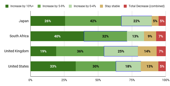
Fig 3. Select countries, and only respondents who identified the correct definition of inflation. “Over the next 12 months, how much do you expect prices (of food, everyday items, energy etc) to change, if at all?” Official forecast rate is indicated with a blue box.
There is more work to be done to understand how understanding translates into expectation.
One other noticeable feature of the data was that older people tended - globally - to have a better understanding of inflation. If salience and exposure explain the results in Argentina (which we haven’t established here, but is a reasonable hypothesis to test further), we wondered whether personal experience of unusual levels of inflation might explain better-than-average understanding. So we plotted historical inflation in a few countries against understanding-by-age.

Fig 4. Historical inflation in select countries

Fig 5. % Correctly defining inflation broken down by age in select countries
In Figures 4 and 5 we’re presenting historical inflation next to the proportion of the population who correctly define inflation in the earlier question, broken down by age, in a selection of countries. Age brackets in the left-hand plot are overlaid according to when the middle of the age band turned 18, a loose proxy for a person becoming economically aware. (So a 21-year old today turned 18 in 2020, 3 years ago.)
Visualising the data in this way suggests there may be a relationship between direct experience of unusual levels of inflation and a better understanding of it. (For example, 18-24 year old respondents in the UK and US, whose formative economic experience has included higher levels of inflation than their 25-34 peers, demonstrate a better understanding of inflation than that age group immediately above them, who formatively experienced quite low levels of inflation. And across these countries older people are more likely to have experienced unusual levels of inflation, and also demonstrate a better understanding of it, at least as we define understanding in this mini-experiment.)
We don’t have enough information to propose a causal relationship here, but again this is an interesting angle for further research.
If you’d like to explore the full data set, drop us an email!